Sign up to view this video
Join Now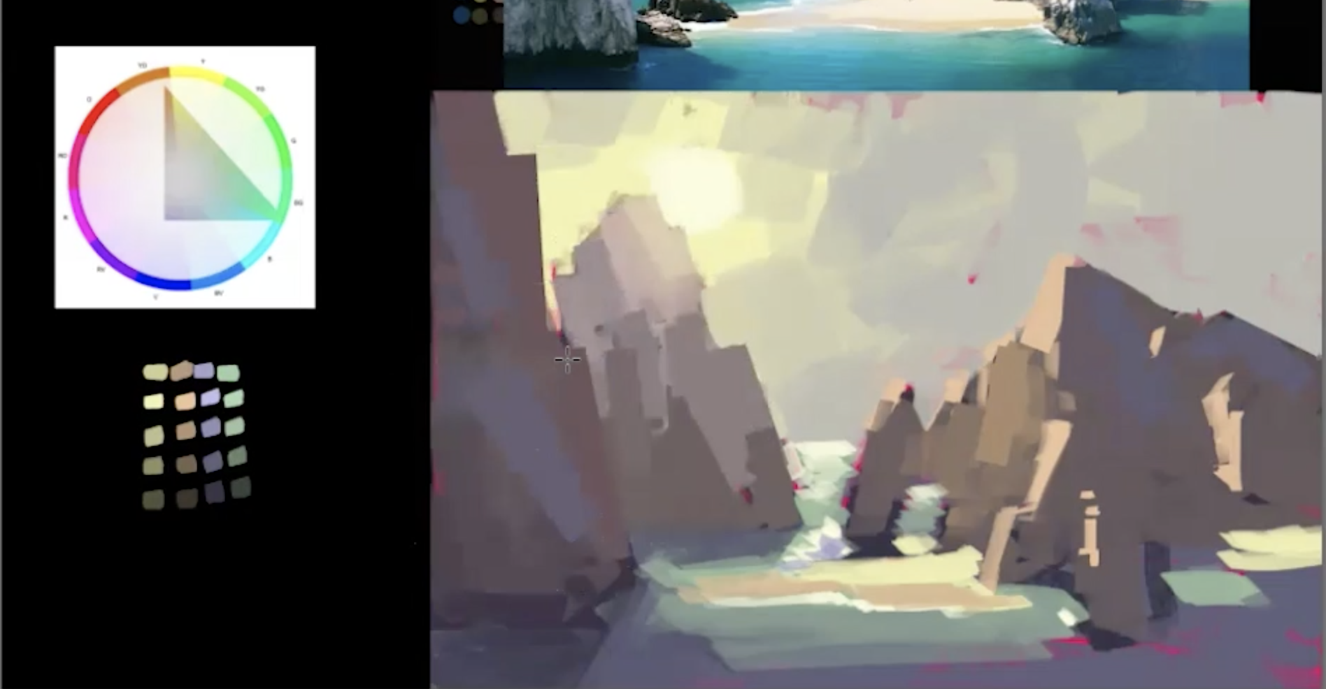
Part 9: Digital Study with Stripped Down Color Palette
In this demo, Mike shows how to push past photo reference and use the limited colors from his gamut mask color palette to create a more moody painting with more harmonious grays. Sometimes, less colors is more and you see how he is constantly stripping down the saturation in his painting to make sure the colors work all together as a whole!
Previous
Part 8: Exploring Mood with Color Keys
Next